If your team likes to discuss the data that reflects the happenings of the sprint, these pointers may help. Team reflections on the past Sprint get more engaging and inquisitive when the discussion is backed up with team progress and delivery trends.

Below is a list of few pointers that can be used to brainstorm their progress during the sprint.
- The progress towards the sprint goal,
- The impediments/risks and how did the team/management huddle around these
- The team confidence vote on their sprint forecast after the sprint planning is done on a scale of 1 to 5 using the first of five techniques. This is an excellent input for teams and managers to again huddle around if the confidence is low on the sprint commitments and what can be done and how can they self-organize to improve confidence levels. Was the sprint execution in line with their confidence levels
- Say-Do ratio (stories delivered versus stories planned)
- Spill Over (stories moved to the next sprint)
- The story cycle time (time it takes for a story to move from In-Progress to Done state)
- The Dev to QA handover timelines if any
Teams can use some of the visual radiators listed below to capture the key data trends for discussion during retrospectives.
These are examples from Rally that is one of the agile lifecycle management tools for agile projects.
Sprint Burn down Chart- This chart displays work remaining and completed in the sprint to proactively anticipate whether the committed work will be delivered by the sprint end date. It is also useful during sprint retrospective meetings, to help identify events during the sprint or problems with estimation during planning.

- Remaining task hours are blue bars.
- Completed story points are green bars.
- Ideal burn down rate is a black line, based on the task estimate
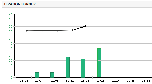
Sprint Burn up Chart- Displays work delivered so far in the sprint to proactively anticipate whether the sprint scope will be delivered.

- The vertical axis represents the accepted work in hours.
- The horizontal axis represents the dates.
- Completed story points are green bars.
- Total scope of work in the sprint is a black line.
Cumulative Flow
The Cumulative Flow diagram displays the rolled-up states of all scheduled items to help you plan and track your sprints. This diagram displays all scheduled work items for the sprint in incremental collections of days as the horizontal axis. Each day displays the rolled-up states of all scheduled items for the increment. The vertical axis of the chart references the total plan estimates in your specified units.

Use this diagram to:
- Forecast and track progress: The states of the scheduled work items indicate the progress of your development as it moves to completion. To determine if you are on target to complete the work within the scheduled sprint, track the accepted state.
- Manage scope: As your scheduled work item bars become level, it is easy to see when excess work is added to an sprint. If the level of the bars does not remain uniform and instead continue to increase, you need to re-address the scope of your sprint.
- Identify bottlenecks: Use the rolled-up states of your scheduled work items to determine if there are trends that indicate bottlenecks. For example, a large section of scheduled items in a completed state as compared to a small amount of accepted may indicate a testing roadblock.’
Sprint Defects by Priority- The Defects by Priority chart provides an at-a-glance view of all defects in the selected sprint, categorized by priority and with any state value other than Closed. Use this chart to help you quickly track and recognize the number of defects of greatest importance, and to ensure defect resolution is progressing in line with the sprint time line. This chart is helpful to verify that the most important defects are resolved first.

Velocity Chart
The Velocity chart displays all accepted plan estimate units for each of the last ten completed sprints. Use this chart to determine your sprint velocity across projects within scope in the current workspace.

Release Burn up Chart – A burn up chart tracks how much work is done. The burnup chart can show more information than a burndown chart because it also has a line showing how much work is in the project as whole (the scope as workload), and this can change. The burnup chart displays work delivered so far in the release to predict whether the release date will be met.

Scope Change – This widget displays all work items (user stories, defects, and defect
Suites) that have been added or removed from sprint, this gives a succinct view of whether scope is changing during the course of sprint.

The Portfolio Item Timeline- This widget allows you to visualize how portfolio items are progressing over varying time intervals. Portfolio managers, product managers, and other executives can use the app to quickly see if a portfolio item is ahead of schedule, in danger, or behind schedule compared to the planned start and end dates. Actual progress bars are colored for quick reference to status.

This data driven approach is an example of using an inside-out approach-i.e. creating a structure that will help inculcate a culture of collaboration and self-organization among teams including the leaders by making using very basic vital information visible and transparent for inspecting and adapting the trend.
Once the discussion is done using some of these visual radiators, teams could set objective goals like 5% increase in a specific area and come up with an action plan for getting there.
Reference- CA Rally Central Help

Thanks Madhavi for sharing this Agile team metrics its very essential and got lots of info